Product design • End to End

Introduction
Winning over a nation and the Virgin Australia’s front line.
This project aims to develop a cohesive boarding pass design with optimised information placement. By addressing these design challenges, we seek to streamline operations for our staff and enhance the overall customer experience.
Research, analysis, product design, design systems, user-testing.
2 designers, 2 product managers, 6 developers, 2 teams
June 2022 - September 2022
Survey, gorilla testing, prototyping, heuristic evaluation, field studies & competitive analysis
PROBLEM STATEMENT
Cabin and ground crew have raised concerns about the inconsistencies in boarding pass designs, which lead to time-consuming processes and negatively impact our on-time performance (OTP).
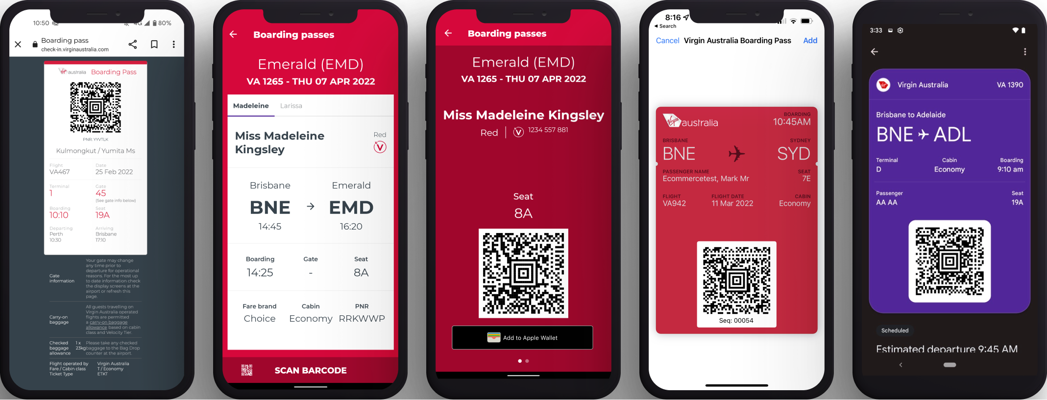
From left to right: Web check-in, Android app screen one, Android app screen two, Apple wallet, Google Wallet (missing iOS app)
BREAKDOWN OF THE PROBLEM
📱 Disjointed experiences
The boarding passes for Wallet, App, Online Check-in PDF, Apple Watch, and printed versions all have different designs and present information inconsistently.
✕ Infants boarding pass not displaying
Omission of infants on Wallet versions, slow down the boarding process. Staff often need to manually print passes during boarding, causing confusion at the aircraft door and delaying departures.
💾 Dated user interface
Old type and colour.
😵 Minor UI issues
Text is hard to read for crew when guests enter the plane and flash their boarding pass and barcode is cut off in the iOS app on certain devices.
Process: Research and Analysis
Survey sent to ground crew and guests
KEY TAKEAWAYS
Survey sent to Virgin Australia customers
KEY TAKEAWAYS

PROCESS: Ideate
Low fidelity UX concept creation
Wireframes & Low fidelity UI: Created preliminary wireframes & UI of potential boarding pass layouts.

From left to right: Web check-in, Android app screen one, Android app screen two, Apple wallet, Google Wallet (missing iOS app)
PROCESS: Ideate
Online Web Check-in

On the left is the current boarding pass shown to guests after online check-in. On the right is the updated design concept.

PROCESS: Ideate
iOS app
When guests check-in online, app users have their boarding passes automatically added to their app.
PROCESS: Ideate
iOS & Google Wallet
The system wallets on iOS and Google have limited space for displaying information on the front of the boarding pass. As a result, important details such as the terminal and tier name are not shown.

Validate: survey
User testing
Sent out another survey to passengers and staff to gather feedback on the designs via our Virgin Australia guest panel.
What did our cabin crew, ground staff & guests think?
KEY TAKEAWAYS
Coherent
A consistent view for staff in the air and on the ground. Vibrant, consistent boarding passes.
Simple
Simpler, clearer information, accessible and bigger text, most important information easily readable.
More streamlined
All the important information for cabin crew is at the top making it easier for them to read when guests show their passes when boarding
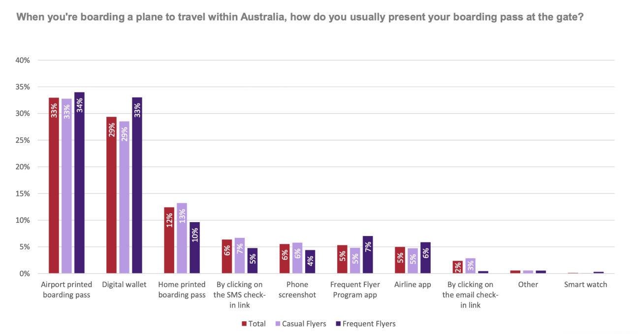
Guests approved
72% of guests find it easy to locate important information on the boarding pass. Guests rated the ease of finding information similarly to the current and updated designs for iOS and Android apps.
Validate: Iterate
Iterative Improvements

Updated based on crew and guest feedback
Validate: Gorilla & usability Testing
Airport Testing: Evaluating the QR code and new boarding pass design with staff both in-flight and on the ground at Melbourne, Sydney, and Brisbane airports.


KEY TAKEAWAYS
Implementation
Implement the new boarding pass design, providing training and support to staff.
Working along side the teams App & Check-in team to integrate the new designs into existing systems, ensuring compatibility across platforms (iOS & Google). Handover also included detailed accessibility notes.

Developer handover file

Accessibility write up with screenreader notes

A pack was sent out to all crew and a new training module was created to prepare them for the coming updates
RollouT & Monitor

Design flaw: An example of what guests would screenshot with crops out the date and flight number.
impact
Boarding passes was rolled out in August 2022,impacting all Virgin Australian travellers and staff. It helped thousands of staff board passengers seamlessly and guests to easily get access their boarding passes.

Key Outcomes
Consistency
Consistency across all platforms creates a better user experience
Reduce cognitive overload
Less stress on cabin and ground crew.
Seamless infant boarding passes
Infant boarding passes to be treated like the physical boarding pass. Having a separate BP is a great solution because it is a really big and annoying issue for GS agents and cabin crew.
Just a nicer experience aye
Branding updated, easier to board infants, one unified boarding pass look and feel. Plus it looks nice. Win.
