
Introduction
Redesign the homepage of Australia's most loved airline through continuous discovery and roadmap creation, all focused on meeting our guests' needs and delivering features they love.
Research, analysis & low-fid product design.
2 designers, 1 product manager
November 2023 - February 2024
Figma, Miro, Glassbox, Qualtrics, Adobe Analytics, Funnelback & Askable
Continuous discovery, usability testing, prototyping, heuristic evaluation & competitive analysis
Weekly stands up, workshops, weekly showcases
PROBLEM STATEMENT
How might we showcase our vibrant Virgin flare whilst helping our customers get value for money, and giving them a homepage that caters to different types of travellers in various stages of their journey.
BREAKDOWN OF THE PROBLEM
📉 Low engagement below the fold
Only 43% of customers are moving below the fold to flight specials.
🎨 Outdated branding
Update out of date branding including type and colour.
🫣 Lack of awareness of frequent flyer program
Guests don’t have a good understanding of the rules around when and where they can use their points.
✈️ Linear flight search
Presently, all airlines provide a singular method for searching and booking travel, posing challenges for travellers seeking personalised trip planning experiences.
🙋 No personalisation
Customers are looking for a variety of things, including - Baggage inclusions and limits, Fare rules and inclusions at certain times throughout their journey.
🗺️ Lack of roadmap
Product managers aren't sure of the next steps and what initiatives to focus on from a customer point of view,

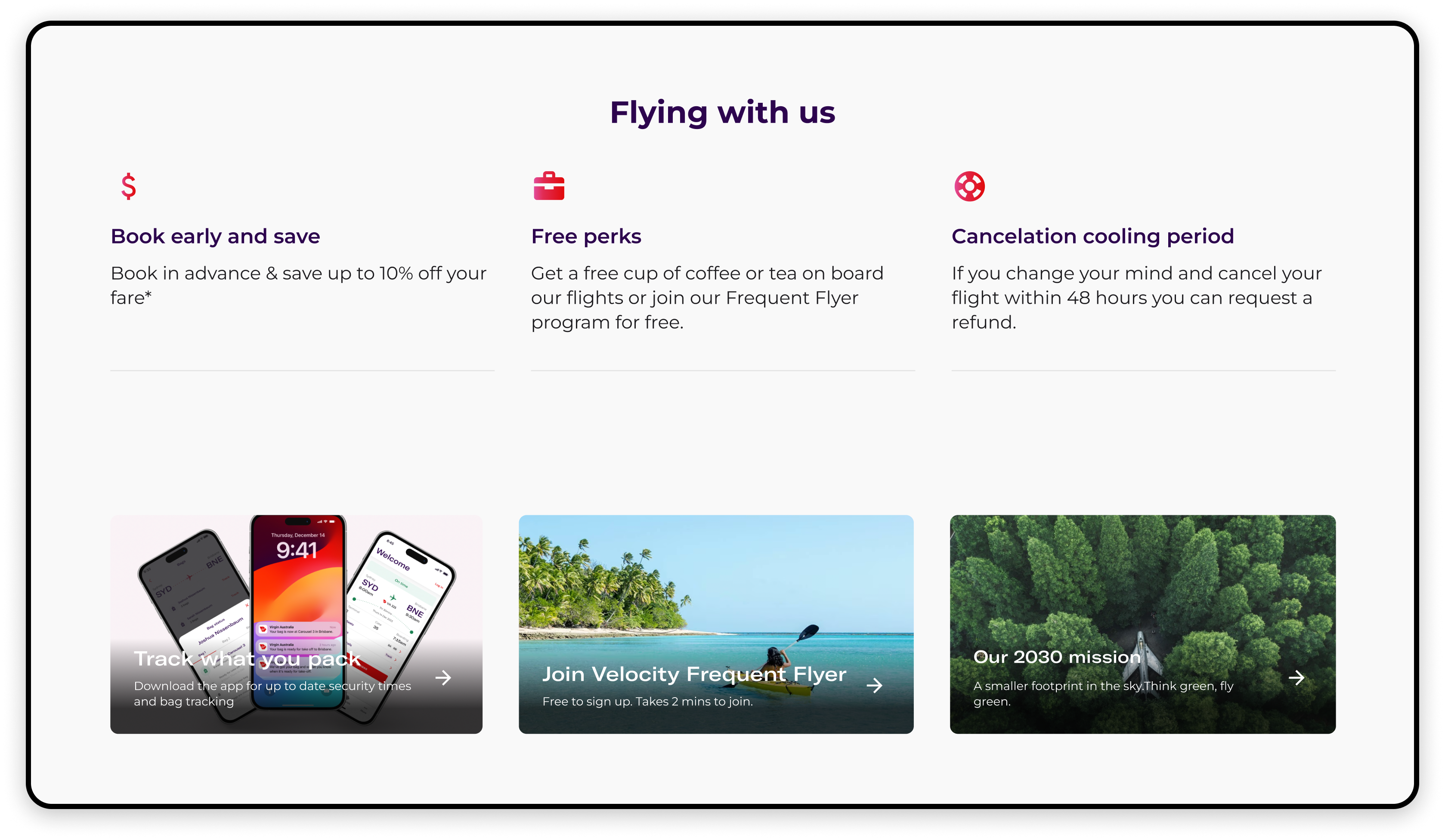
Current homepage
Solution
A complete travel journey. Considers the type of guest (family, business, nervous traveller) at different stages of the customer journey.
We should differentiate ourselves from other airlines by showcasing our brand's unique character and playfulness, unlike the generic homepages common in the industry.

Evidence to claims. Social proof - Client logos, reviews and awards, partnerships. Embedded sign up to Vmail.
“What’s in it for me?” “Why should I do this?” People frequently ask themselves these questions when considering a purchase or action because they’re looking for benefits & Marketing space.

Social proof and influence. Entice users to take action by showing the number of people who have flown with us.
SolUtion: Condensed customer journey map
To demonstrate how the website dynamically changes according to the user's persona and journey stage, I combined storytelling with mock-ups. Meet Lexi.

Lexi
Leisure traveler • Silver member
Dream
Dreaming of the next holiday
Plan
A reason for travel has occurred
Book
Booked the flight
Organise
In the led up to the flight
Go
Go to airport and fly
Solution
Recommendations for Lexi
Creating innovative tools to enhance the planning and booking stage in their journey, with the ability to bundle ancillaries to help guests find value for money .
Lexi comes to the Virgin Australia website to look for inspiration for her 30th.

Destination themes
She will be able to search for destinations based on different themes. Is it a sun-soaked beach escapade for her milestone celebration, or perhaps a quest for maintaining Gold status?

Insert TikTok & Instagram reels
To help inspire Lexi's next destination.

Ability to explore with points
Lexi knows she has 20,000 points but isn’t been sure what to do with them. By seeing where she can fly with her points it gives her an idea on how she can save.

Packages
Seeing packages allows Lexi to weigh the costs of package tours versus doing her independent planning. Whilst seeing multiple locations in the same region allows her to see what is the cheapest port to fly in and out of and if they are on special.
Lexi decides to celebrate her 30th birthday with a dream trip to Tasmania. Excitement peaks as she starts researching flights and deals, turning her travel dreams into a concrete itinerary.

Frequent Flyer loyalty
Virgin Australia, recognising Lexi's loyalty and efforts, presents a panel that quietly echoes her journey so far.

Ability to customise your homepage
Lexi sees a prompt to customise her homepage. She enters her departure point, the nature of the occasion, her preferred destination radius, and the approximate duration of her stay.

Finding the best deal
Lexi's homepage now offers relevant information about Tasmania on the best travel times, perfect for her budget-savvy approach. A new Tasmania tab reveals package deals and flight options to multiple ports, empowering Lexi to find the most cost-effective entry point.

Finding a reward seat
As a Silver member, Lexi has never flown enough to consider reward seats and is unfamiliar with them.
However, a tool that displays reward seats in a monthly view and allows easy destination updates and reminds her to use her points.
Opportunity
Presently, all airlines provide a singular method for searching and booking travel, posing challenges for travellers seeking personalised trip planning experiences. What if you could search for articles, packages, reward seats and specials based off what you have entered. Creating new ways and tools to help through the planning stage and get into the booking stage.
Lexi decides to celebrate her 30th birthday with a dream trip to Tasmania. Excitement peaks as she starts researching flights and deals, turning her travel dreams into a concrete itinerary.

Itinerary added
Lexi booked her flights to Launceston, and the homepage automatically added her booking for easy access.
Virgin Australia offered her a special deal on hotels, travel insurance, and cars to assist with the rest of her planning.
In the days leading up to her flight, Lexi will check multiple times if her flight is on time and review what inclusions they need for their trip.

Contextualised ancillary/bundle recommendations
She is delighted that the ancillary bundle matches her travel choices and preferences. Recommend ancillaries based on her previous behaviour.

Car hire and hotel
Lexi is also shown car hire and hotel deals for her dates and destination.
On the day of travel, Lexi receives a reminder to check-in and heads to the airport.

Boarding pass & weather at location
Lexi gets reminders such as time until boarding, weather conditions at destination, boarding pass and any last minute ancillaries at the airport.
Impact... So far
A refreshed flight search and marketing banner was released in February 2024. Through test and learn (A/B) experiments, we assessed how the updated designs would affect the high traffic on the homepage. The impacts in the last 30 days include...

Key Outcomes
Reduced banner height size
B. Additionally, it serves to highlight promotions, special offers, and featured content, contributing to overall brand promotion.
Cleaner branding
Embracing the new look and feel with the Virgin Australia gradient complimented with new type and colour palette.
Improved flight search
Cleaned up some nasty and clunky interactions, when searching for a flight helping customers get through flight search more seamlessly.
The process
A bit more detail of how we got to the solution.

Discover | Current state
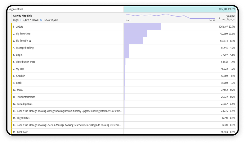
Assess current data and insights
In the first stage I gathered all the data we currently had from Adobe analytics, Glassbox, Qualtrics, SEO and previous research. Then completed further research such as Continuous Discovery, Competitor Analysis and facilitated multiple workshops.

Glassbox data. Interaction heat map of VA Homepage.

Clustered qualtrics feedback themes in Miro.

Funnelback shows search results
Abode analytics

Overview of qual and quant data gathered
Discover | Workshops
Kick-off

Miro - Ideation creation workshop completed
Discover | Competitor analysis
Jetstar packages
Packages were something that was of interest for participants.
Clear help & contact us links
Jetstar and Qantas both have clear help links in the top and bottom navigation, getting guests the help they need ASAP.
Jetstar is simple
No useless & boring article information. Straight to the point.
Baggage links on the homepage
Qantas has quick links on their home page that helped participants navigate to the most important pages on their site.

Qantas and Jetstar are the two competitors in the Australian market.
Discover | Continuous discovery
Weekly continuous discovery
By interviewing weekly it helps us to continuously discover opportunities, test our assumptions and helps us keep tabs on these constant changes in the industry.Research included journey discovery, competitor analysis and task completion.

Figma decks for playback sessions with the team (commercial, devs & product)
Define
But what does it all mean!?
After analysing and synthesising all the data, the main insights were for users on the homepage were:

Unclear flight schedule
“Please include an option to search by dates with open destinations.”

Unclear inclusions
Guests are unsure what their inclusions are for different fare types e.g. seat selection and baggage allowance

Airlines can be boring
A lot of airlines are text heavy that no one reads. They are all so boring. Where is the life!?

Can’t find information
Guests seek information on baggage allowances and fare rules throughout their journey.
How do I use my points?
Guests often misunderstand the rules for using their points.

Guests love bundles and packages
Its easy, time saving and the convenience is what draws people. Especially if you are saving money.
Guests the use of tools to help find savings
Using tools like Skyscanner or Google Flights to find the cheapest that fits into their certain criteria. Things like graphs and grids to help find lowest fare or reward seats.
Final UX & Prototype
Continually modifying prototypes to address previous findings and address our next objectives.

Now to work on UI.
